Best Practices for Enhancing Collaboration Between Designers and Developers
A comprehensive guide to improving teamwork in product design using Figma
I have been involved in front-end development since 2007 and have experienced the pre-jQuery, jQuery, and MVVM era. I have a deep understanding of front-end development basics. From 2021 to 2023, I worked as a front-end lead at ByteDance Ltd., the parent company of TikTok.
First, let's align with the fundamental principles of design thinking

As we know, product design involves iterative cycles of understanding, exploring, and materializing.

In this process, the further we progress, the more costly it becomes to implement changes. Therefore, I recommend maximizing iterations through rapid prototyping and user testing during the design phase.
Do your best with prototyping

In traditional engineering, skipping prototyping is unimaginable. You can't wait for a rocket to launch and explode before redesigning and refining its structure. However, in web design, we often overlook or even skip prototyping.
Generally, there are two types of prototypes: wireframe and high fidelity. Each has its appropriate use, and I think we should not skip any stage lightly.
Wireframes
For wireframes, the focus is on information architecture, user flow, layout, and user interaction. Other visual elements, such as color, background, animation, and shadows, are usually deliberately ignored at this stage.
You should repeatedly confirm these questions during the wireframe prototyping and user testing processes:
Where should users start?
What steps must they take to achieve their goals?
Are there any technical means to simplify these steps?
What are the most important elements that appear on the screen at each step, and what are their priorities?
How should the elements be arranged for easier reading and interaction by users on the screens of common devices?
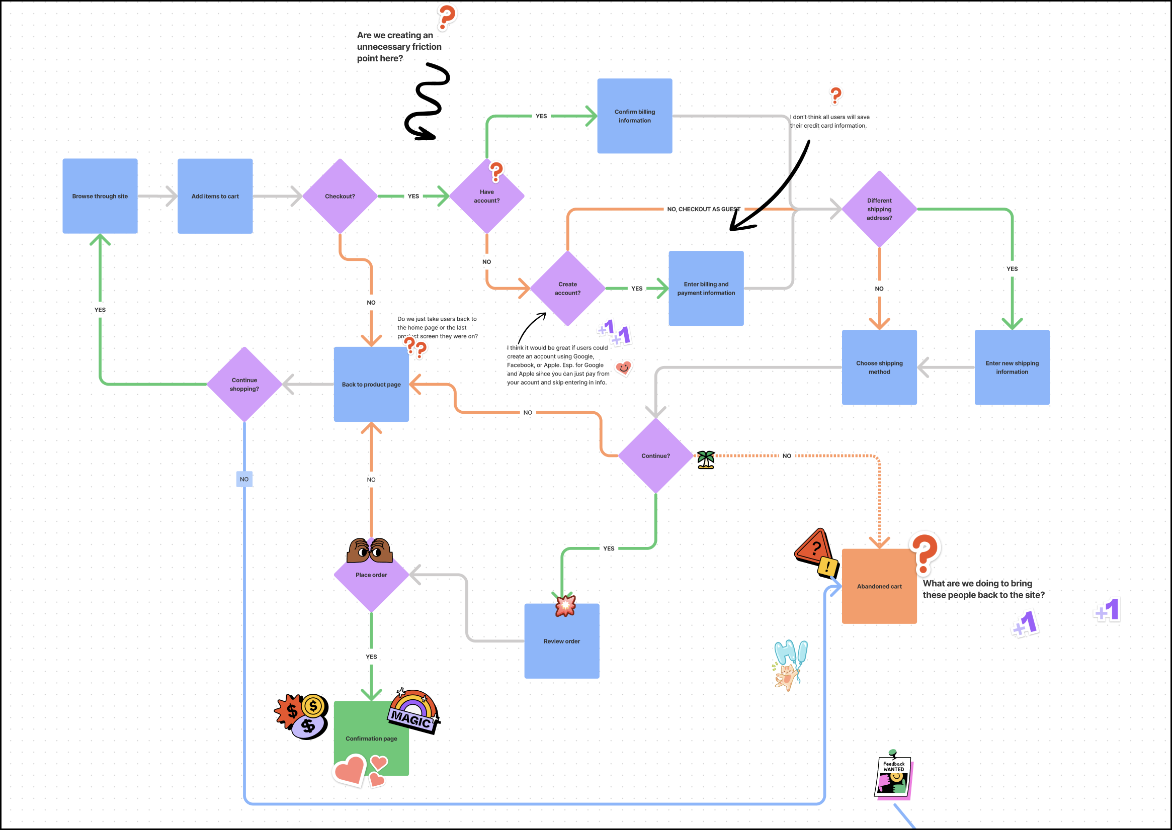
During this process, we can also gain clearer user flows with the help of FigJam:

The more time we spend on this step, the more comprehensive our understanding and consideration of requirements will be, enabling us to avoid unnecessary revisions later on and helping us launch new features sooner.
High-fidelity prototypes
High-fidelity prototypes are detailed UX simulations or fully coded products used for user testing or developer handoff. Ideally, they should look exactly like the final version you will see when it's published. This may seem challenging, but luckily, our existing design library can make this process easier.
Challenge: Users are not interested in our prototype demonstration!
There are two key steps that could help address this issue:
Complete the main prototype flows and demonstrate it in presentation view rather than the default edit mode view.
Change the avatar, name, images, text, and other content as much as possible to make them familiar to your target customers. This helps users feel a sense of connection.
Of course, this approach takes a bit more time, but it's still much quicker and more convenient than waiting for the engineering team to write code, set up a database, and deploy it to the preview environment.
Thinking about the big picture
Many times, we spend weeks or even months hurrying to release a new feature, only to find that nobody is interested. Hardly any users click on those buttons, no matter how appealing we make them, or most users leave before completing the first three steps. Some other times, we change a navigation bar globally for new features, but after release, we encounter unexpected problems with the basic usability of other modules.
Focus on tracking metrics and user flows from the beginning
It's recommended to clearly define how to measure the feature's success before beginning any future design. This will help us focus on designing events and creating more effective user flows for better conversion.
Design the different states, such as loading, error, empty status, and other edge cases
Technically, we use the Form component from Ant Design, which includes various interaction and validation states. We should ensure these states match our brand's visual system consistently. This way, the different interaction states of our form components will meet expectations by default, without needing any overrides.


The same principle applies to global loading, skeleton, empty states, etc.
Consider potential conflicts with existing functions or flows as early as possible
A recent example is that we completely restructured the global menu on the left side of the home page, making it look much simpler, but we did not consider how the menu would be displayed under other pages.
As a result, the engineering team first developed a custom solution for the home page, then implemented a global rollout at the request of the product designer. However, after the new static design went live, it became apparent that it was incompatible with many of the old pages, forcing the engineering team to modify the global menu again within a single day. Similar issues continued to arise, posing significant challenges to the stability and user experience of our platform.
How can we address these issues? Before starting any new design, consider these questions:
Will these changes affect other pages or modules?
How will the new design work on mobile devices?
Should there be variations for different user types (such as different levels of paid subscriptions)?
Do these variations conflict with existing logic?
Listing all the logic branches using a table or mind map can greatly help prevent similar issues. This logic is a crucial part of the product requirements document (PRD) that product designers need to consider carefully. They should think it through thoroughly before handing off the design. This input is essential for the engineering team. Skipping essential design thinking and expecting to constantly ask questions or make patches during development and testing, or frequently applying hot-fixes with each release, does not result in a satisfactory product. Instead, it creates chaos and often frustrates users.
Always start with a frame that has a predefined size

Compared to sections, frames have predefined sizes for the most popular devices. This helps you set the correct scale from the start and consider how your design will look on common devices. Also, frames have the concept of Constraints and can easily apply layout guide styles from our design system, whereas sections cannot.

learn more about the difference between Figma Frames and Sections if you are interested:
You don't need to be a Figma expert. Just replace sections with frames and avoid randomly scaling top-level frames can greatly improve basic layout issues.
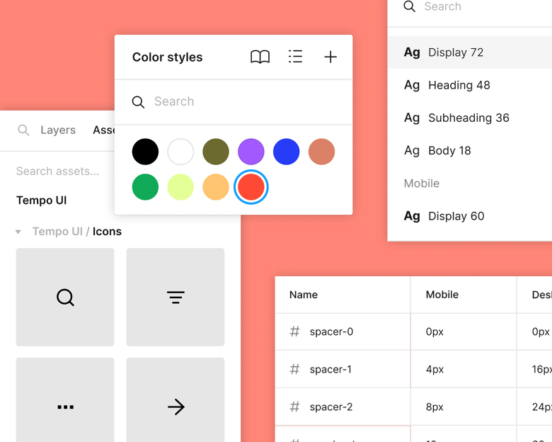
Always use the predefined variables

Avoid scale text and layout layers
Please use the move tool and auto layout to resizing with constraints most of the time. This ensures that all border widths, border radius, and font sizes remain unchanged while resizing. The only exception is when you want to resize an object and also adjust its stroke, font size, or other attributes proportionally!
The scale tool can be handy for situations where you want to resize a group of elements at once. This makes sure all elements, including text, are scaled consistently. It also allows you to ignore other settings, like constraints.
This can lead to fractional font sizes or layers with subpixel positions and dimensions. Aside from annoying pixel perfectionists, it can also lead to unwanted export artifacts and dimensions.
If you just want to change the size of a text layer in relation to other elements in a design, we recommend adjusting the Font size in the Typography settings instead. This makes sure your font size is a whole number.
Create and maintain an effective design system
A design system is a collection of reusable components, guidelines, and assets that help maintain consistency and efficiency in the design process. It serves as a single source of truth for designers, developers, and stakeholders. Here’s a great introduction to design systems.
Creating a design system involves defining typography styles, color palettes, grid systems, iconography, and other visual elements that align with the brand's identity.
A design system that aligns both design and code can streamlining the product development process:
Product designers don't need to be Figma experts. They can simply select predefined variables, styles, and components.
All the font sizes, gaps, padding, spacing, and colors will be automatically generated by the design system. Developers can simply copy and paste from Figma without having to think about it. When everything goes well, we no longer need to repeatedly deal with layout and font size issues during testing.
We have had a design system in place for years. However, due to staff changes, there are now a few minor issues. We just need to make some refinements to keep using it smoothly:
Version Control: We currently have two design systems: 💎 Pietra Design System, which was originally created by Kapil and is somewhat outdated, and 🖌️ Design System V2 - WIP, which was recently created by Pareshi and currently has only a few variables ready for development. For a code repository with more than five years of history, it is acceptable to have two versions of the design system coexisting. This ensures that our large amount of legacy code remains functional while allowing us to gradually migrate to the new version. I have exported all variables from both design systems into the code. Since they have different naming conventions, we can use them together.
Naming conventions: Custom property names are case-sensitive—
--my-coloris considered a different custom property from--My-colorin CSS. Therefore, we have astylelintrule to ensure that variable names follow kebab-case (keep all letters lowercase and connect words with a hyphen) to avoid potential confusion. As a result, variable names likeXLandXXLin Figma are not valid for code. We need to ensure all variable names are always in lowercase.Icons categorization: We have published a private NPM package named
@pietra/iconsand created three workflows for icons: filled, outlined (where strokes are converted to fills in the outline paths), and colored (where all fill colors and gradients are preserved). We should categorize the icons in Figma the same way as in the code: place them in the filled, outlined, and colored frames, and replacealternatewithfilledoroutlinedin their names.

Align the form components: Currently, the form components in Figma, such as buttons, selects, and inputs, have different properties than those in the code. As a result, we have to customize these components repeatedly. We should align the design and code of these components once to avoid any more repeated overrides.

Instead of building all the input components from scratch, we can simply copy them from the Ant Design Open Source (Community) Figma.

A checklist for design review
Individual abilities are always limited, and no matter how hard you try, you might still miss some details without realizing it. So, before the design moves to the development stage, having colleagues review it can help reduce problems caused by accidentally overlooking something. Here is a checklist I recommend for the design review process:
How to measure the success of the feature and what’s the typical user flows?
Will these changes affect other pages or modules?
Should there be variations for different user types (such as different levels of paid subscriptions)?
Do these variations conflict with existing logic?
Are page-level containers frames with common device resolutions rather than casually sized sections?
Are all font sizes, border sizes, rounded corners, spacing, etc. directly referenced from predefined variables in the design system? Are they all integers?
How will the new design look on different devices, such as 2K and 4K screens, MacBook Air, MacBook Pro, tablets, and mobile phones?